
Current brand system
One identity.Two working surfaces.
trackmyprop is a desktop-first trading suite for futures and forex traders, built to grow across markets. The public brand tells that story on warm canvas; the product turns it into a precise, adaptable workbench.
Public story
The Ultimate Suite for Futures & Forex Traders
Product workbench
Real interface, current releaseShared: lowercase name · Inter · precise geometry · color with meaning
Identity
Recognisable at every size
The pixel bolt is the fastest expression of trackmyprop. Pair it with the lowercase wordmark when the name needs to be explicit. Use ink on light surfaces and paper on dark ones.
Keep the artwork intact. Do not redraw, recolor, rotate, outline, or add effects.


- Name
- Always trackmyprop, always lowercase.
- Compact use
- Choose the mark when the wordmark would become hard to read.
- Background
- Use the version with the strongest clean contrast.
Color system
Separate surfaces. Stable meaning.
Marketing uses a fixed editorial palette. The product supports several interface presets. Those systems stay separate, but positive, negative, warning, and live states keep the same meaning everywhere.
Select any swatch to copy its value.
Public palette
Warm neutrals carry the story. Saturated color must communicate state.
Interface presets
Preset color is a user preference, not a financial signal.
Default
#f5f5f5Graphite
#121212Sage
#1a442bCobalt
#28426dProduct semantics
Outcome colors do not change when the interface preset changes.
Typography
One family, tuned for the job
Inter is the brand typeface. Marketing uses the display cut at a larger scale; product UI uses Inter Variable for compact, familiar reading. Numbers use tabular figures when they change or align.
The font files and license are included in the complete kit.
Display · 600
The Ultimate Suite for Futures & Forex Traders
Section · 600
Every trading account, one clear view
Body · 400–500
You trade on your platform. trackmyprop coordinates the accounts, records the fill, and keeps the full story clear.
Data · 500 · tabular
+$4,218.5068.4% consistency09:41:26
Product imagery
Show the real suite
Product imagery is evidence, not decoration. Use current interface captures and preserve enough context to show what the Trader can understand or do.
Do not place controls over the screenshot or invent data outside the product.
Track
The complete account view
Accounts, challenges, payouts, and performance in one place.
Journal
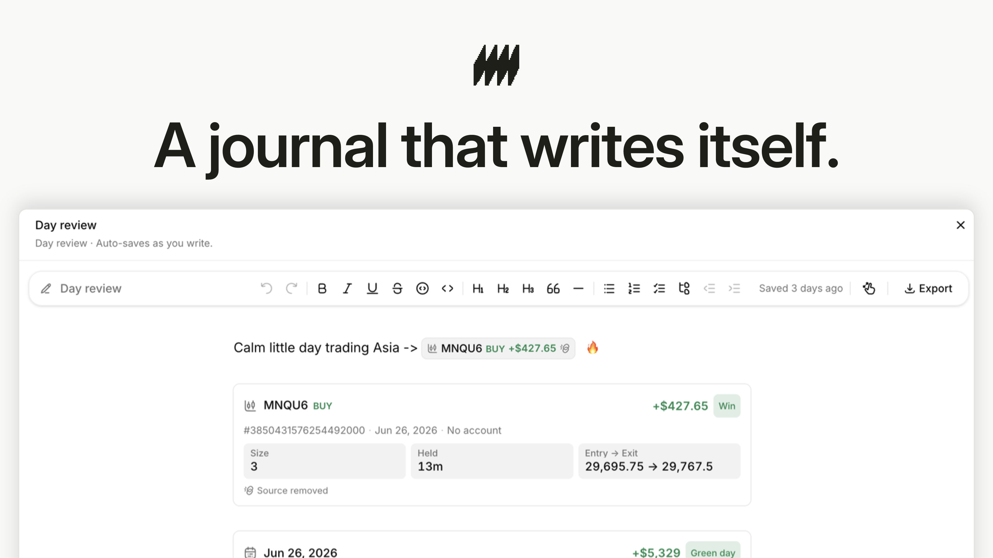
The record writes itself
Every fill stays attached to the review and its surrounding context.
Tools
The numbers behind the trade
Calculators and simulations live beside the activity they explain.
Applications
Ready for every public surface
The kit includes profile images, banners, digital icons, social examples, and the font files used to make them. Static examples export at 2× their listed design size for crisp publishing.
Use the generator below when the message changes.



Publishing templates
Evergreen examples for announcements, product proof, and data stories.














Digital icons & fonts
Favicons, touch icons, Inter files, and the font license ship in the ZIP.


Graphic generator
A fresh graphic, still on brand
Choose a layout, compose the message, and render a publication-ready PNG. The studio applies the current mark, typography, palette, safe zones, and 2× export scale.
The preview updates only when you ask, keeping every render deliberate.
Voice & usage
Clear, trustworthy, premium
Premium means coherent and dependable—not ornate. Write from the Trader's side of the screen, describe the connected system plainly, and stay honest about what happens on the Trader's execution platform.
Do
- Write trackmyprop in lowercase.
- Present one connected account, copier, journal, and tools suite.
- Say that execution stays on the Trader's chosen platform.
- Use sentence case and direct, specific language.
- Use green, red, and amber only when they carry meaning.
Do not
- Write TrackMyProp or TRACKMYPROP.
- Describe the product as only a copier, journal, or prop-firm tracker.
- Imply that original trade execution happens inside trackmyprop.
- Add decorative gradients, glow, glass, or trading-dashboard clichés.
- Recolor, rotate, outline, or redraw the pixel bolt.
Questions or approvals
For press, partnerships, co-branding, or a format not covered here.